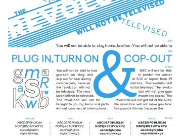
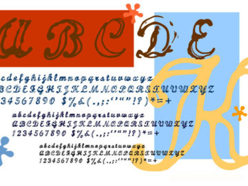
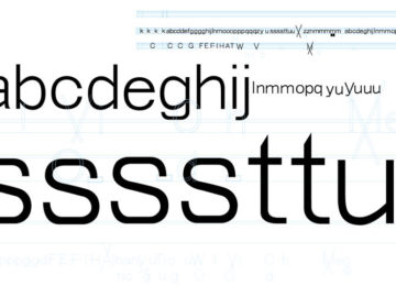
This poster design was printed letterpress at Cooper Union and features samples of the final typeface I designed as part of their typography certificate program. The typeface itself, called telesync was designed to read clearly on retina screen devices.
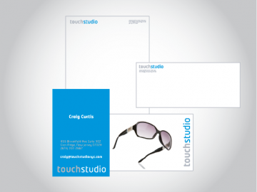
Identity for Touch Studio
Logo type-treatment, letterhead and business card designs for a photography and retouching studio.
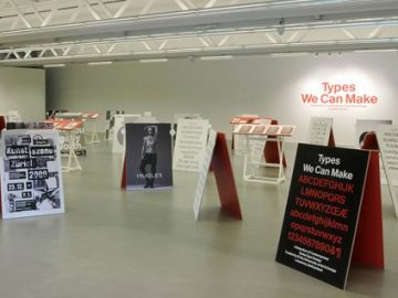
Types We Can Make
My work was exhibited as part of the Cooper Type program in 2012, this is a shot of the room.
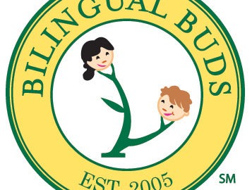
Logo Overhaul for Bilingual Buds
Bilingual Buds is a Mandarin school for children in two locations. The new logo is quite an improvment over the old in terms of legibility and credibility.
Redrawn Logo
The Actors Studio didn’t have a digital version of their logo for use in web and tv, so I redrew it for them from their old printed pieces.
Logo for Globorati
My company Wonderbred worked on the logo and web site for the launch of globorati, a luxury travel blog. Their brand has since emulated itself more on Monocle, but the logo design is still in use.
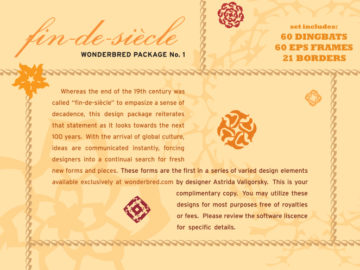
First Commercial Typeface
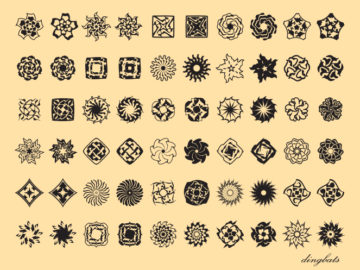
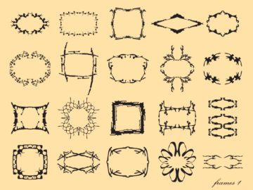
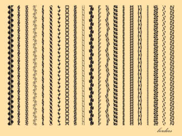
To learn Fontographer I started off easy, following Zuzana Licko’s example of a dingbat typeface, I created this kit of dingbats, borders, and frames. Since the whole notion of working with typographic devices like borders and frames is something seen more at the end of the 19th century- I named this kit fin-de-siècle. The design motifs are also very 1890′s, if you’re a fan of type specimens of that period.
This kit has been out through garagefonts.com for quite a while.
Early Type Efforts
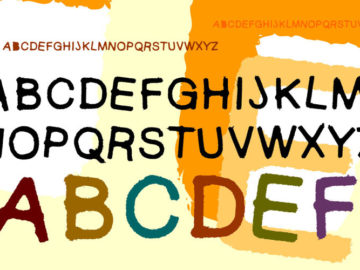
Before I learned the software to design type I did a fair amount of experimenting in trying to learn how to devise type. Most of this involved Illustrator software. I can see myself trying to learn some basic principles, that were much more readily apparent in books that I would later be pointed to. I still like the experiments.

